Date
January 2018
My Role
UX/UI designer
Timeframe
3 months (6 sprints)
Tools used
Sketch, Illustrator, React Native
Project & outcome
Here’s the TL:DR…
In 2018 Google introduced it E-A-T principles as SEO guidance for financial and lifestyle websites (YMYL). As an online financial comparison site offering prices and guidance, Mozo fell strongly into the “YMYL” (your money, your life) category so it was vital to address these new principles to keep abreast of SEO guidelines and demonstrate the quality of the services and content offered to potential customers.
The EAT acronym stands for Expertise, Authoritativeness and Trustworthiness. There was an urgency to add content that Google wants to see in order to improve Mozo’s credibility.
I also saw this as an excellent opportunity to understand the user and to come up with solutions in way the company could be presented online via their website to embrace customers by providing personalised touches.
Expertise - the site should feature content that demonstrates the expertise of content writers
Authority - content must be valid, comprehensive and truthful. It must demonstrate credibility
Trustworthiness - the website should be authentic and trustworthy. It should demonstrate site security, site quality, inbound link quality and reviews
The additional pages, features and UX improvements ensured that the standards defined by google were met, and set Mozo up for future success as their customers increased.
Determining success
to rank higher in google search results
gain reputability and raise brand awareness
increased site traffic
increased leads and income
Research
SEO and web principles are something of particular interest to me so I signed up to, and successfully completed, an SEO and Content Marketing course and a Digital Marketing Transformation Bootcamp at Sydney’s Australian Institute of Management to gather a deeper understanding and some inspiration on how I could implement improvements to the customer experience.
At Mozo I spent a lot of time researching competitors so I already had some ideas of what the company may be lacking on their website. I also reviewed other financial blogs, news sites and lifestyle blogs for further inspiration.
Brainstorming
Brainstorming site improvements to address SEO guidelines.
Next I sat down with the dev team and we established the smaller jobs that could be completed as a priority.
As we needed to produce some new pages from scratch, we identified this as a perfect opportunity to really get the site’s style guide up and running
Understanding the customer’s needs
Customers come to price comparison sites to save themselves from doing the hard work in finding the best deal for them. It is essential to bear in mind that it is their money they are parting with.
So what are they looking for?
A reputable company powered by real people who aim to offer the best possible savings to the consumer.
Understanding the business needs
While it was evident to add features to enhance trust and expertise, in dealing with money I raised that it was essential that the necessary compliance information was clear in all instances. Transparency in finance is crucial to the user and I felt on some pages that this was not displayed in a logical location, or that the text was too small to read.
Addressing SEO
This was a collaboration between myself, the content team and the web director:
ensuring that the business google details were correct
ensure high quality meta tags were applied
gather reviews from existing customers
add videos to the site with transcripts to enhance keywords
add clear, useful FAQ sections
Demonstrating EAT principles through enhanced UI and UX
Here is how I went about some solutions (note: some overlap in terms of expertise, authority and trust)
EXPERTISE
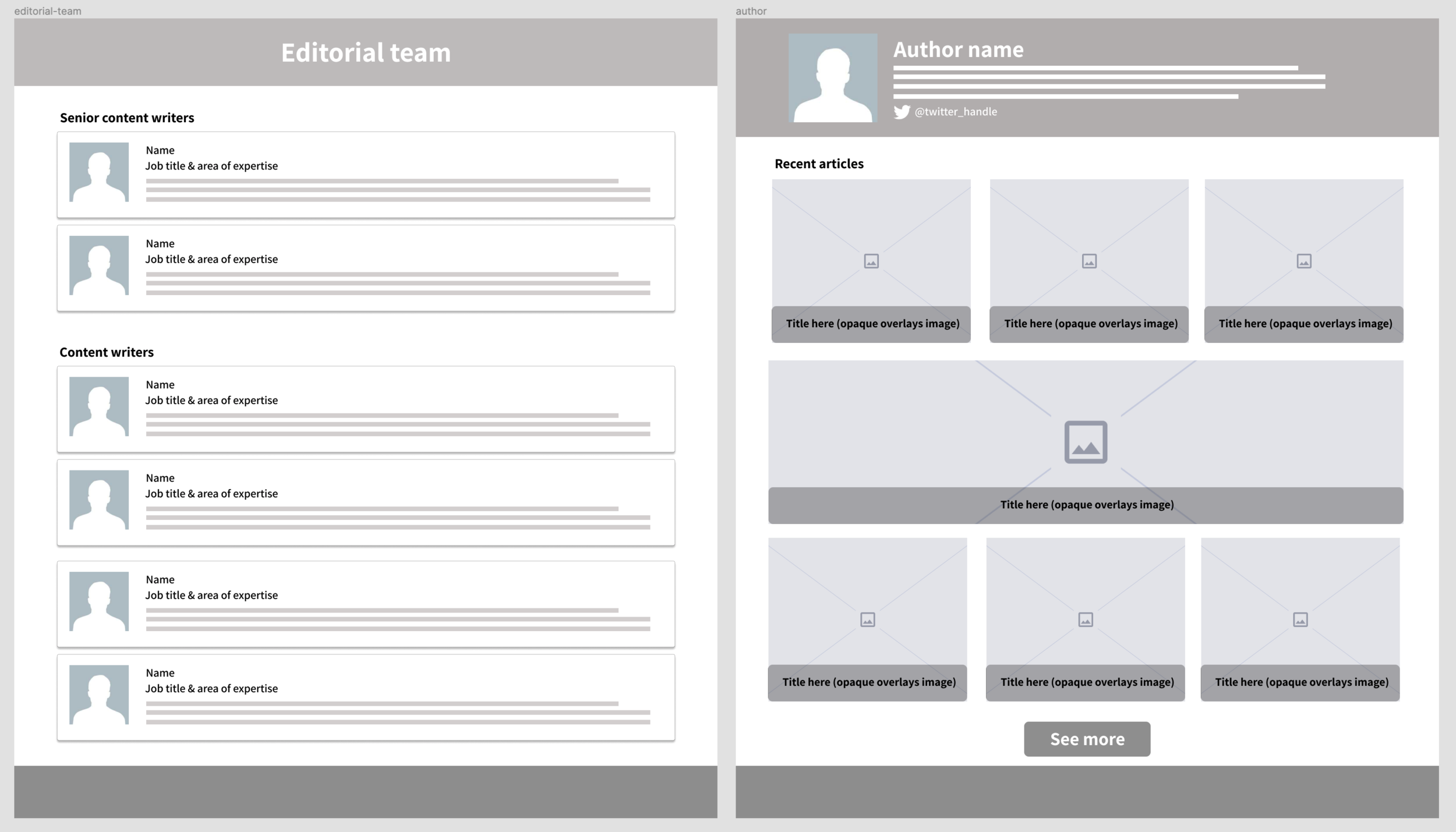
I felt it was important that visitors to the site were able to learn more about the people behind the advice and content so that they could be confident that they were making an informed decision and receiving valuable advice. My solution was to create an editorial team page, whereby the user can learn more about the writers and their experience and area of expertise, and also an individual page for each writer/expert so that the user can learn more about them and see an overview of their editorials along with twitter handles.
AUTHORITY
Media coverage
Mozo is often featured in the media yet this was not clear or visible on the website.
Originally there was an “as seen on” MREC located at the top of the screen but it was not clear to the user, and simply looked like it was unrelated to the company.
I proposed that an “as seen on” bar was placed above the footer (therefore visible on every page) and that the homepage should display the most recent television appearances.
The idea was to give the user confidence in trusted, relevant and timely appearances
TRUST
Footer
Visible on all pages, no matter where the user is directed from - a central position to display company credentials and demonstrate that it is a living, breathing, up to date source.
Add business address and a “contact us” page link (I designed a contact us form/page so that the user was able to message directly from the site)
Add the awards that had been won
Add social media links
Enlarge compliance text to demonstrate transparency
An “about us page” to let the user know the company background, the company values and a visual image of the people behind the business
High fidelity mock up samples
Project wrap up
This project was constantly evolving as the company focussed on link building, launching new products and distributing more awards and this is just an overview of some of my contributions.
The block elements and assets that I styling for the high fidelity mock ups were added to the styleguide and this certainly had visible effects on the speed of front end development.


