Date
March - July 2021
My Role
UX Specialist
Timeframe
~ 2 months (8 sprints)
Tools used
Figma, User testing
Project & outcome
Here’s the TL;DR….
SocietyOne is different from a bank. It is an investor driven Personal Loan provider striving to increase originations of Personal Loan acquisitions to increase its revenue and presence within the financial marketplace.
The company is transparent with all employees about competitor stats and was upfront about their revenue goals and shortcomings. My role as a UX specialist was newly created to relieve the burden of design from a Graphic Designer and Business Analyst. I was able to take ownership of a stalled project and drive forward the design and development of a digital banking app that combined an everyday Transaction Account offering that allowed customers to manage repayment of their personal loans.
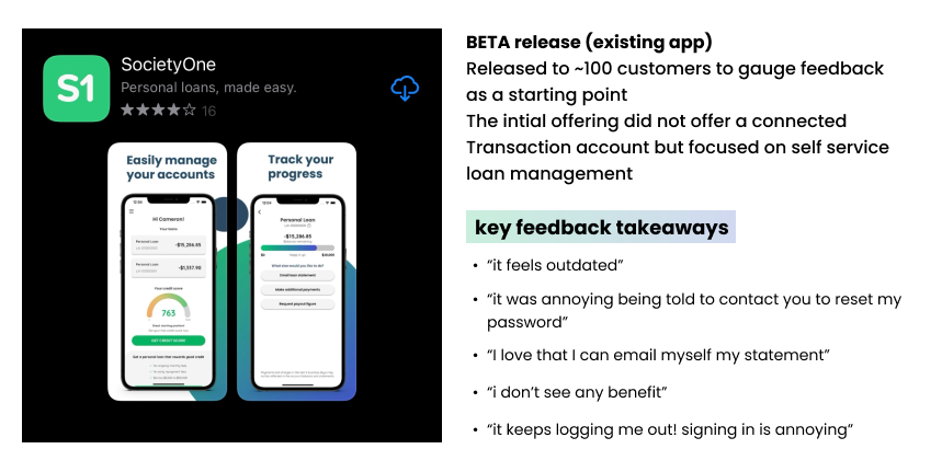
The project had already seen the release of an application for users to make loan payments, monitor credit score and receive loan statements.
Outcome: MVP Beta release showed significant positive customer feedback and alleviated volume of internal work for call center staff.
The second lockdown resulted in the project being put on hold temporarily but my most elements of my work were kept alive and rolled into the present day release.
Understanding the business needs
In conjunction with Westpac, S1 had been planning a digital banking application for around 12 months. In expanding their products by introducing a debit card and basic transaction account they would gain an edge on competitors.
The initial low-fidelity wireframing had been mapped out so I was charged with a UX overhall and UI update to modernise the product with new branding.
Understanding the customer
The 2020 COVID19 lockdown saw Personal Loan uptake increase significantly with customers seemingly taking a “YOLO” approach to life. The increased number of personal loans was causing strain on the in house customer care team in managing repayment issues and hardship enquiries so introducing a self service repayment solution would empower the customer to manage their finances.
One of S1’s USPs is that the customer can check their credit score at any time without it being affected. Customers have highlighted they want their credit score at their fingertips.
The existing app - BETA version
The MVP was already in release/testing stages when I came onboard. This dealt with loan management but did not have the Transaction account feature - the main challenge of the project!
The new application
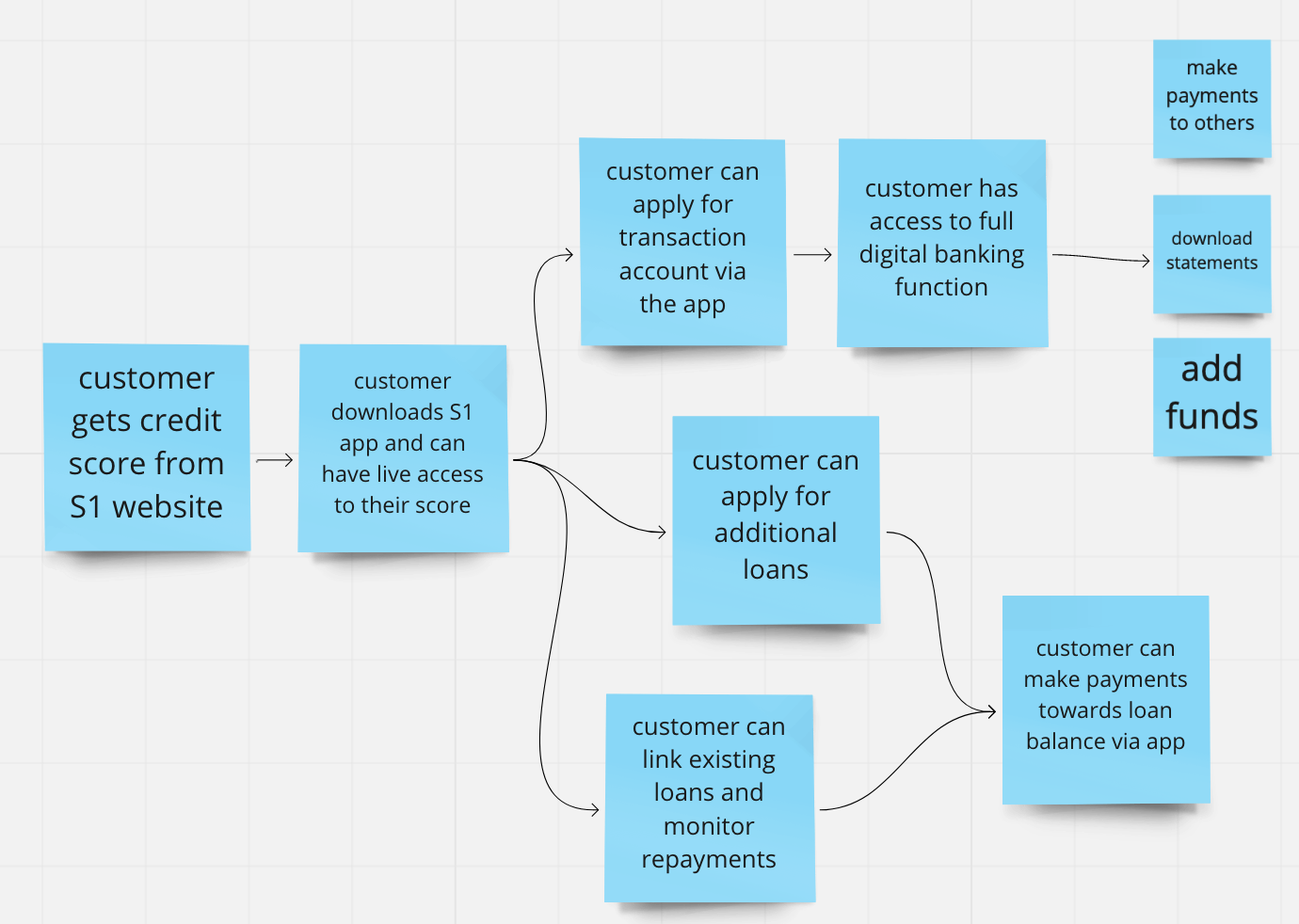
Identifying the key features and required functionality (v1)
Minimum functionality of first release covering the following scenarios:
1. credit score/loan/banking only
2. credit score + loan(s)
3. credit score + banking
4. credit score + loan(s) + banking
Customer feedback & Guerilla testing with the existing concepts
Although I was unhappy with this method of gathering feedback for the new app, I teamed with the Project Manager and BA to present/walkthrough the low-mid fidelity existing FIGMA and MIRO screens (shown left) to customers via video call and to later to S1 staff across data/compliance teams uploaded to their personal devices.
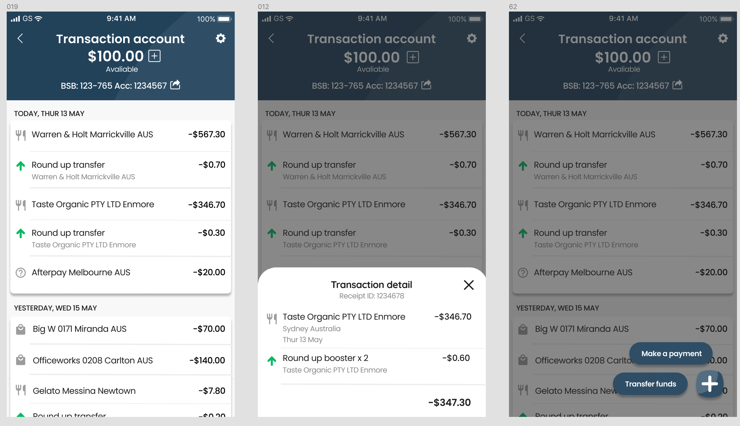
existing low fidelity banking screen concepts
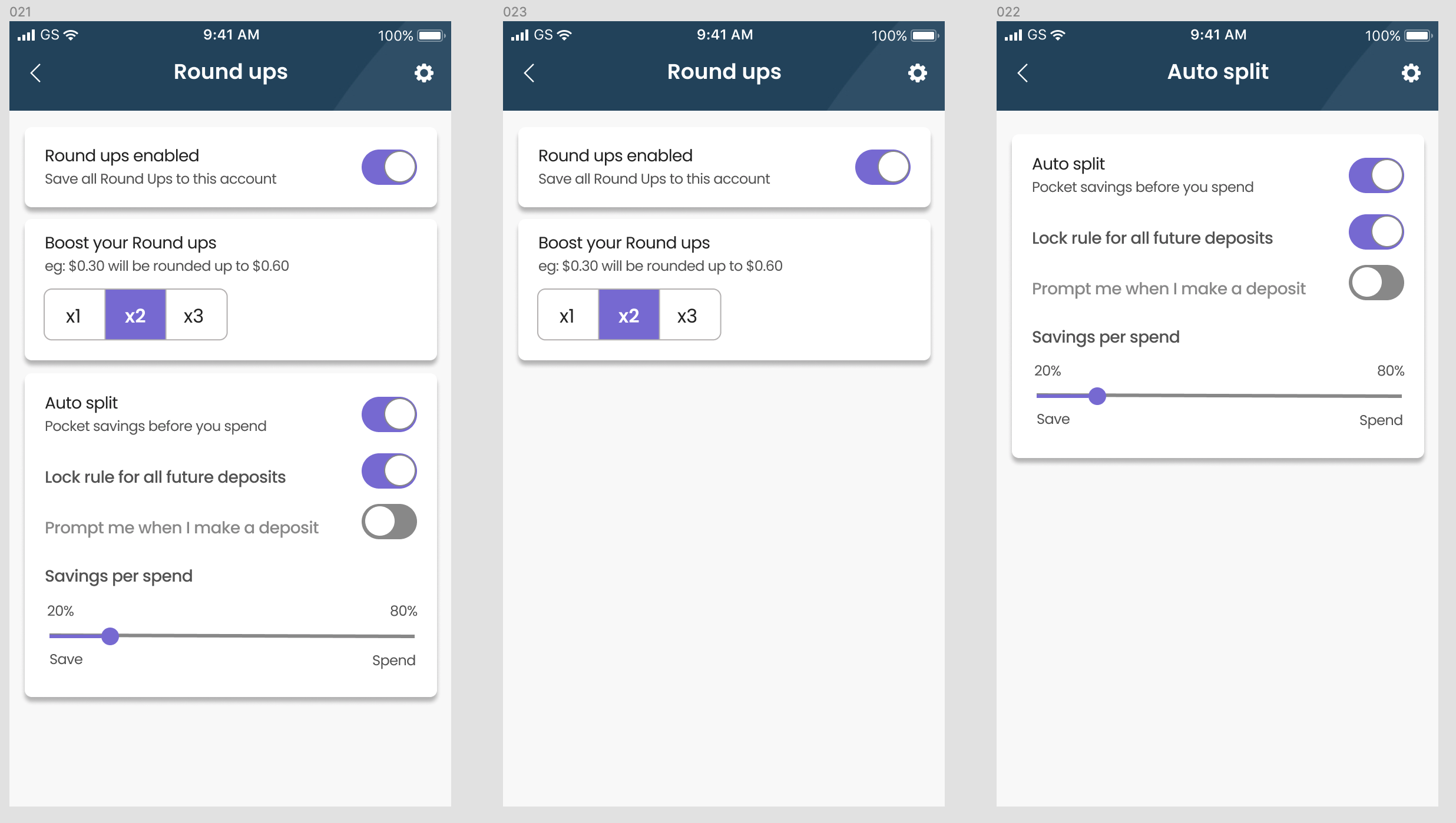
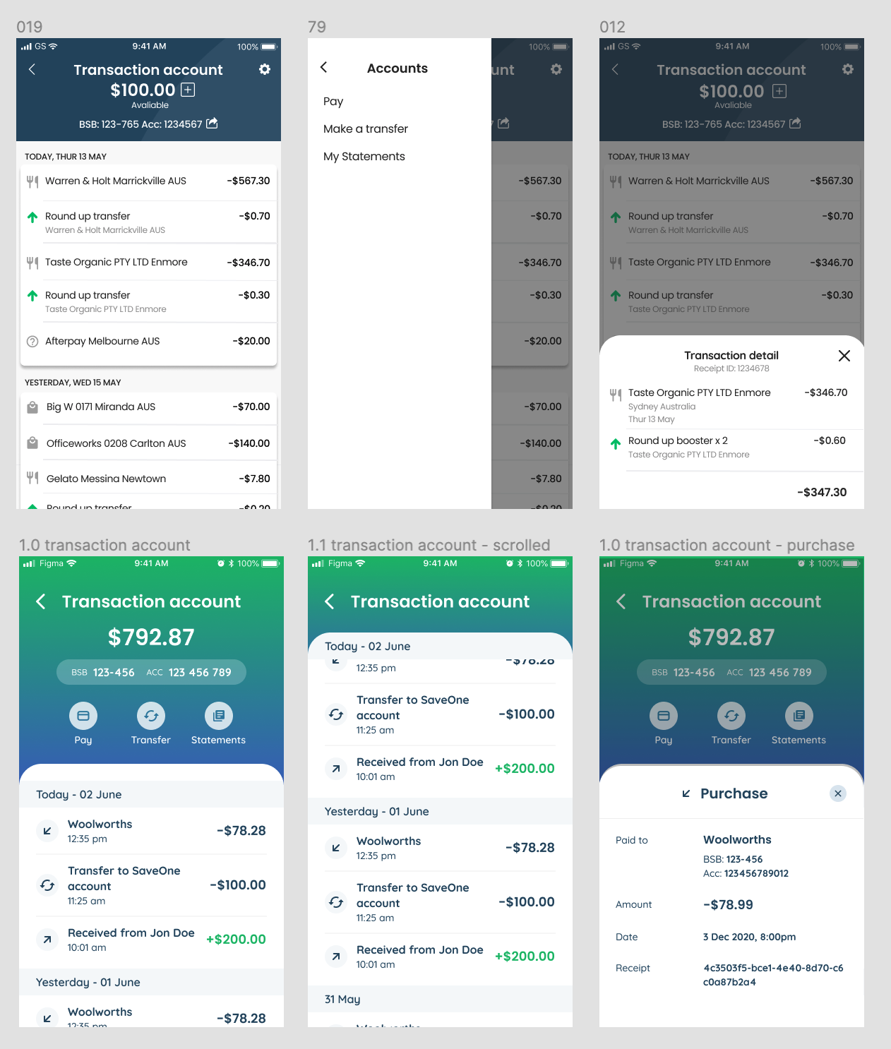
One of the proposed features of the banking function was to implement round ups and splitting transactions to allow the user to pay off their loan balance whilst using everyday banking.
This was re-prioritised to be implemented into a later release as it was found to be too complicated and needed more thought.
Here’s an overview of key responses from customers and internal staff:
from here, I identified the essential improvements for MVP release testing:
Revise log in process with focus on security - essential for a banking application
Review the UX copy (a passion of mine!) - again, essential to enhance user trust in product
Target the design to audience, refine playful icons
Introduce consistency of menus and input field behaviour
Streamline the application process
Make the banking screens simplified and intuitive
As always, I worked closely with the lead dev to iterate designs and glean feasibility. I was lucky to work with a talented team who were confident they could style to match branding.
Overview of my concepts
key focus 1 - Improved log in and account recovery
sign in - utilising updated native ios/android log in methods, focus on improved security.
account recovery concepts - users were unhappy with being locked out and forced to contact customer service to verify account. Since initial design conception password recovery methods had advanced in technology.
key focus 2 - refining the application process
I condensed the loan application process to drastically reduce the number of screens and proposed a new UI.
The original mock ups relied heavily on radio buttons and drop downs which resulted in arduous interactions.
key focus 3 - the banking screens
For initial testing the user should, at minimum, be able to:
1. see their transactions
2. make payments to others
3. view a statement
1. See transactions - I simplified pay/transfer/statement functionality by having them be visible at all times rather than having them hidden beneath a cog that triggered a slide-out menu of actions.
2. Make payments to others
* use material design form fields for consistency
* introduce institution verification
* restyle UI for clarity (enhance accessibility, remove drop shadows)
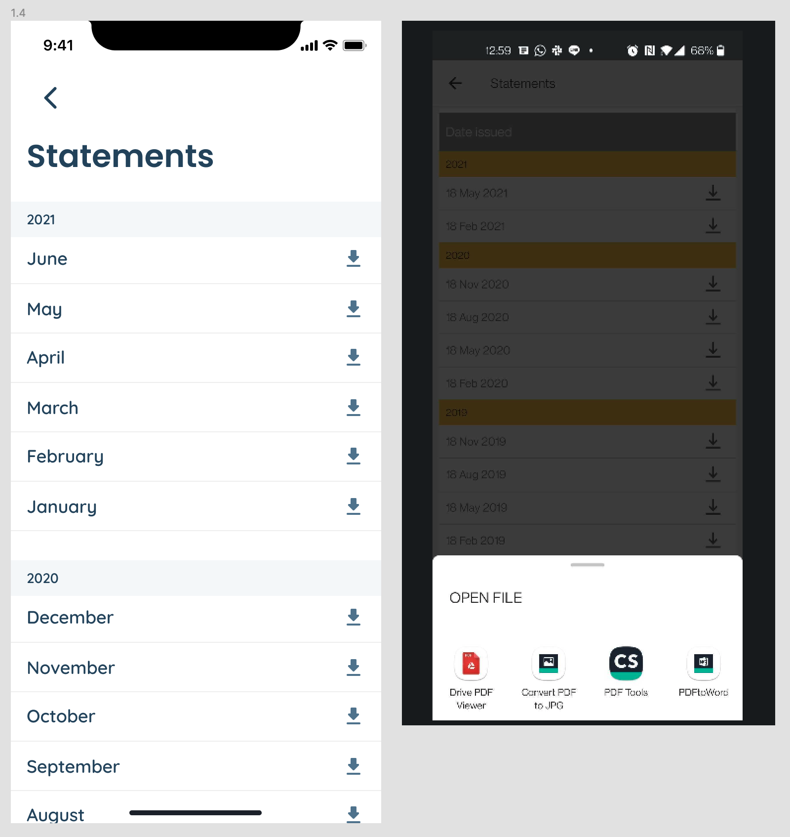
3. view/download statements (incomplete)
I proposed that as a minimum user is able to select a statement and download or view via ios/android native functionality
The final stage of my time on this project
The challenge of managing stakeholders…
I wanted to include a little mention of this as it was one of my main challenges whilst being involved in this project.
Stakeholders expected pixel perfect design iterations which was a huge pain point in rapidly prototyping such a complex product.
Upselling products to drive originations was the key concern of the businesses stakeholders therefore it was challenging to present pixel-perfect design options for long deliberations and manage design decisions versus strong opinions.
As the home screen dealt with the many scenarios of what products the customer may or may not have it remains an outstanding challenge to reach the right solution…
Home screen iterations to address the many product scenarios.
Here’s where my story officially ends 😢
As Sydney was thrown into its second long term lockdown, the business decided to pause development on this project to focus on online originations.
In reviewing the app as it stands now at the start of 2022 I am happy to see that my new concepts have been adopted and evolved into the user experience.
What would I have done next?
an exploration of customer cases to refine the product combos to be displayed on the home page (analyse data, review stats, talk directly to customers)
develop payments to address BPAY
further explore the key idea of linking Transaction accounts to loan repayments


