Date
November 2017
My Role
UX/UI designer
Timeframe
4 weeks (2 sprints)
Tools used
Sketch, Illustrator
Project & outcome
Here’s the TL;DR….
Marketview is Mozo’s custom built business desktop only analysis tool. It provides up to date, detailed comparisons and industry data to assist customers with their products, pricing and customer service and sales teams to get a competitive advantage. It is available for retail banking, and more recently, energy markets.
It offers a dashboard display of the user’s product and pricing in comparison to their competitors and sends out daily change notifications to alert user of any useful changes in the market.
Sales of Marketview stalled for Mozo in the 2011-2012 period. The design is dated and is no longer attracting attention, despite how useful its function has proved to be for users.
This project was one of my biggest project wins whilst working at mozo. The redesign was presented to one of the Big 4 banks, who had been resisting purchasing the product for several years. They were impressed with the improvements and promptly signed up as a customer.
Challenges
Due to stalled sales and loss of profit this project was marked as urgent and there was a big push from the Sales and Data Managers as Stakeholders to launch the new version ASAP.
I had only been at Mozo for a short amount of time before I took ownership of this project so the first challenge was to familiarise myself with the product, it’s purpose and it’s users.
Marketview handles large amounts of data and due to the urgency of release and limited dev resources I had to ensure I created a saleable product with as litttle changes to the existing data structure as possible.
Stakeholder Interviews and understanding the customer
I arranged to meet with the Sales and Data managers immediately for a Q&A session in order to understand what was expected from the redesign and to learn more about the users of the product.
Who uses this software, what is their role and purpose?
Based on feedback what are the existing users pain points?
Do you have reasons why recent sales pitches have been unsuccessful?
What are your thoughts on the current design, is there anything you like and what do you dislike?
What will determine success?
I learned that users are typically data analysts, sales or managerial staff. The data allows them to see what their competitors rates and pricing are and notify them of any changes so that they can stay in line with the market.
Here is a summary of their other responses:
“Users find the current design hard to read, the navigation is cluttered and overall the product looks dated which makes them question it’s effectiveness”
“The data needs to be more readable at first glance and users have reported that filtering data is confusing”
“The software lacks any mozo branding ”
“Success obviously means sales, but ultimately we want a product that we can be proud to present at sales pitches”
This is an overview of the original design.
At first glance it certainly looks dated, the colours distracting and navigation bar serves only to confuse the user.
Finding the solutions
Navigation
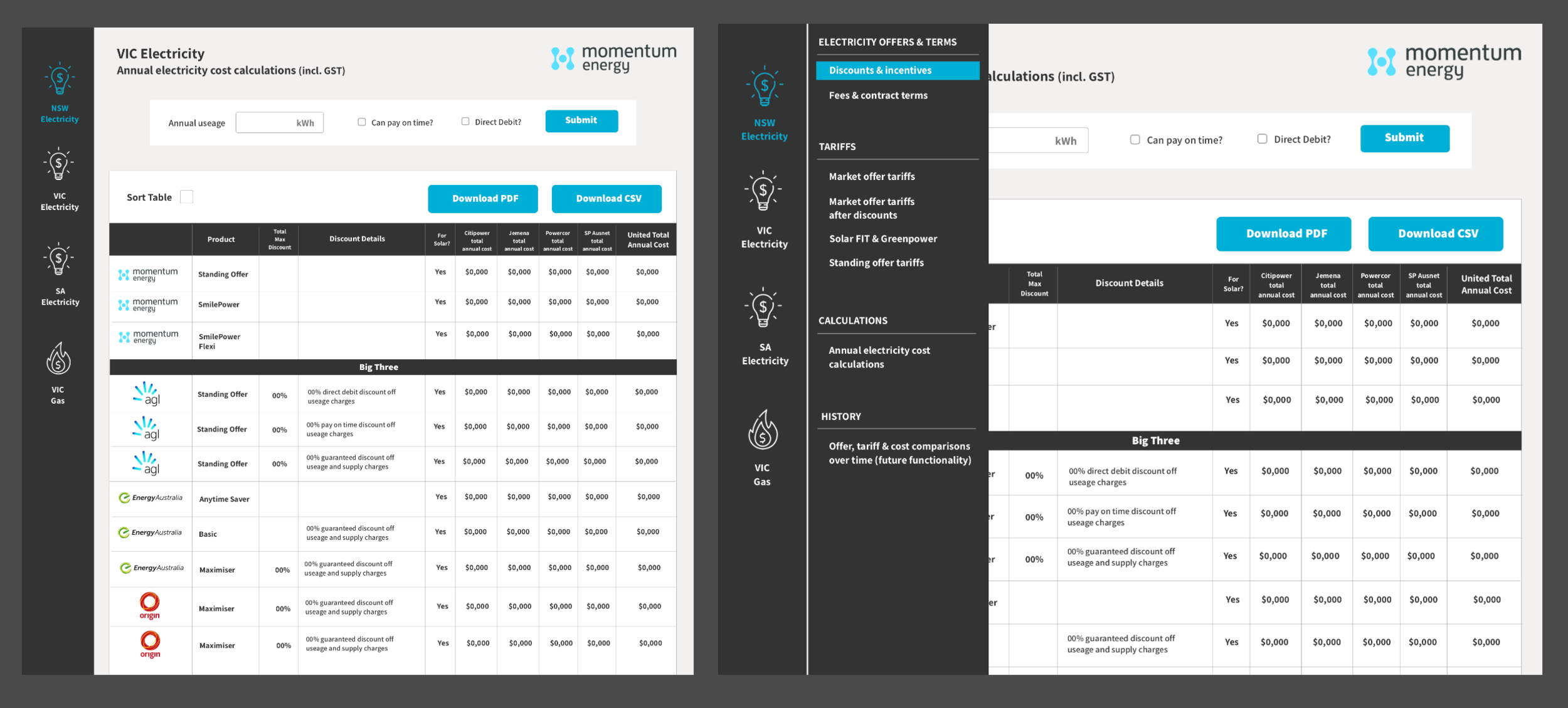
I decided to start by addressing the complicated navigation bar. I had already thought that the best way to approach this project was to introduce a more “dashboard” driven look and feel, inspired by the CRM systems and Agile sprint software that I was enjoying using at the time.
I knew that I wanted the navigation to run the left hand side of the page, and I knew that I wanted to use icons rather than text for the primary navigation. I wanted to reduce as much text on the pages as possible in order to make the data more readable.
I consulted with development and they were confident that the new nav design was feasible within the time frame.
I used Mozo’s default icons styles to keep within brand
These are high fidelity mock ups of the final nav design. I quickly found through iteration that there was a danger of making the icon library far too complicated. I overcame this issue by adding small labels beneath which allowed icons to be re-used (see example)
Customer branding/customisations
This wasn’t necessarily the second step in the process, it was something I was mindful of throughout the project. I wanted to ensure that we established a design system whereby a touch of the customers branding could be easily applied. The user’s logo was already shown at the top left of the screen, so I wanted to use the main colour of the logo for active nav items and hovers and buttons.
A standard red and green colour was applied for alerts and errors.
I reasoned that these small personal touches would inspire confidence in the product and it’s ability to meet their needs.
Improving overall readability
In order to make the data more readable at a glance, I replaced company names with their logos. At first I was unsure if this was feasible but after presenting my designs both stakeholders and development agreed with my reasoning that it gave the user to scan the page and pick up the competitors they were most interested in at that time. It was somewhat painstaking sourcing each logo, but definitely a worthwhile decision.
Table display
I proposed making the table dividers collapsible again to allow the user to focus on specific data rather than be overwhelmed by a massive expanded table.
I also altered the appearance of any tabbed data, purely as an aesthetic which was accepted by development.
An example of collapsable table sections and tabbed data designed with ING’s data as reference.
Adding mozo branding
Here’s where I ran into real difficulty….
At the time, mozo had no definitive branding guidelines so I quickly became caught between two of the company’s founders (one not even a stakeholder in the project) with their opinions about the rules surrounding the logo and it’s usage.
One argued that the mozo logo must only be green under any circumstances, they also maintained that the “leaf” motif could not be separated from the “mozo” text, and that the font (“chalet”) could not be used for any text other than “mozo” (therefore not “marketview”) The other argued that this was “powered by” mozo, rather than the core mozo product (financial comparison website) so black and white text was perfectly acceptable. The battle raged on…
To try and appease both parties and their opinions I quickly created some HD mock-ups to show them how their ideas looked (and so that I could articulate to them my thoughts with a visual reference)
These are the 6 options that I was asked to mock up. Usually I would be firmer in owning my design decisions but as a newcomer to the company my boss advised it was best that I appease the two strong personalities.
Upon presentation I advised that options 2 and 4 were overcomplicated (something I had strived to improve throughout the redesign) and that options 5 & 6 could be interpreted as buttons.
I wasn’t happy with any of their ideas so I created an option 7….
I created this logo as a solution.
It meant that the “mozo” logo was kept as green only, that in theory “marketview” was a product so the company font as a logo should be allowed, and that “powered by mozo” was in the company’s secondary font “Assistant”) as a compomise.
Both founders were left happy with this solution.
What did I learn from this clash of opinions?
This was a valuable lesson that has driven me forward in my career but ultimately gave me great experience in listening to opinions, valuing them and communicating that they are valued, but then by able to explain my design decisions with good reasoning in order to implement what I felt was the best solution.
I also put documenting company branding guidelines as a priority task to be tackled ASAP!
Adding the finishing touches
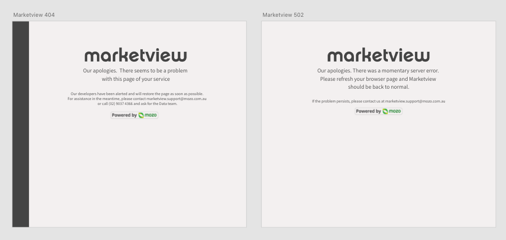
Now that branding was finalised I created error pages, updated sales documents with new screenshots and most importantly tested the software within a range of browsers and reported any bugs that were promptly rectified by the dev team.
The product was now ready to be presented.
error pages
Project wrap up
This project was one of my biggest project wins whilst working at mozo. The redesign was presented to one of the Big 4 banks, who had been resisting purchasing the product for several years. They were impressed with the improvements and promptly signed up as a customer.


