Date
February 2018
My Role
UX/UI designer
Timeframe
6 weeks (3 sprints)
Tools used
Adobe XD, Illustrator
Project & outcome
Here’s the TL;DR…
As a price comparison site, a user is able to get price comparisons for loans that will suit their business. Mozo also offers a service where their “business loans expert” will call the customer back and work with them to find the best price for their needs.
There has been a loss of leads generated leading to significant drop in profits. From monitoring the pages, I discovered that there was a large drop off point of users both after the results page, and on the web form page. While the page used to be fairly successful the system
was dated and acquisitions had reduced leading to significant loss of potential profits.
I successfully completed a UI and UX overhaul which led to increased conversions made from the business loans, more calls completed as potential customers and improved site wide style guide components and web form behaviours.
Challenges
Limited development time, stakeholders changing priorities and introducing an experience that leads the user to engage with the service.
Customer journeys
Original customer journey
New customer journey
Solving the problem
It is important that the user feels that the results they are seeing on the business loans landing page are reflective of their needs. The user also needs to be alerted of the specialised callback service before they lose interest and leave the page.
I wanted the user to be confident that their results were tailored, to highlight the callback service and provide more information about the loans expert and to increase customer trust.
Business loans landing page
I researched what mattered most in terms of customer data used to generate pricing estimates and mocked up a simple webform for the user to interact with.
Upon scroll, an eye catching but non disruptive sticky bar appears at the bottom of the screen to prompt the user to engage in the callback system.
Web form behaviour (filter)
In introducing a new web form as a filter, it was ideal an ideal opportunity for me to map out a standard user experience for interaction that would then go on to be applied to all future forms.
This was important since moving to React Native as the primary backend development tool. When a user submits a form, the results are displayed almost instantaneously, therefore the user is sometimes unaware if their submission has had any effect on the search results.
I sat down with one of the development team to bounce my ideas and find if my ideas were feasible.
1. User clicks webform and light mask appears so that the form is the main focus
2. On click of CTA a spinner appears within the button and the mask fades out, to give the illusion that the page is loading
3. User now sees a clear “showing 10 of [number of results]”
The referral page
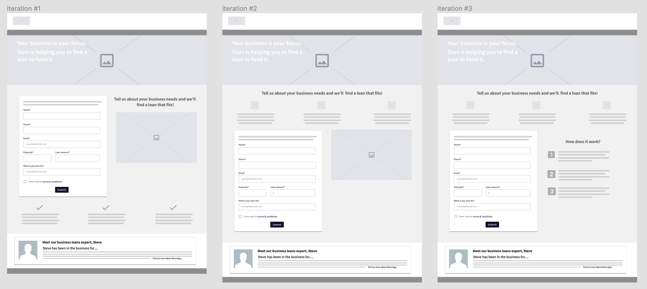
I was handed content requirements from the editorial team and set about creating some wireframes…
Iteration #1
Stakeholders asked for image used in header of business loans landing page to be incorporated for consistency. First draft had selling points of mozo’s loan service placed beneath form as also suggested by stakeholders
Iteration #2
I disagreed with the first placement of points. They were important and users should be able to digest them as further encouragement to complete the form. From feedback, I altered the ticks to mozo themed icons so that the selling points are not confused to be steps
Iteration #3
I strongly believed that the use of the image on the page was superfluous and was able to convince stakeholders of the same. Once they saw the mock-up, they decided that a “how it works” section would be beneficial and I firmly agreed
Some rough high-fidelity mock ups created just afterwards using mozo brand styling to demonstrate overall look & feel for feedback. I updated the look of the webform to match the material design trend at that time
I also selected the header image to compliment the tagline “your business is your focus”
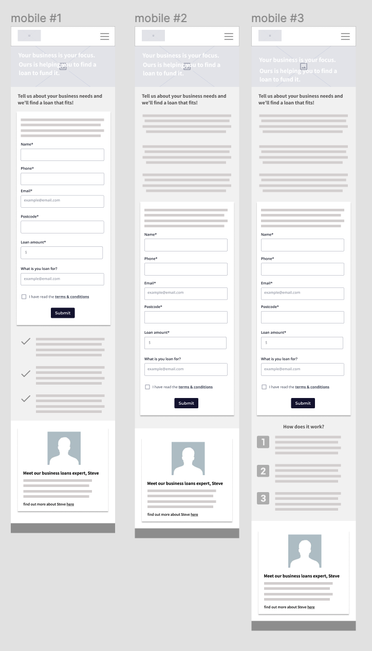
And for completeness, here are the mobile wireframes. I always design to a grid with a view to addressing mobile devices first.
Callback webform
When the user submits the form, the button again shows a spinner to emulate an action occurring. The form is then replaced with a thank you message and some links to navigate users to some other popular products
Introducing the expert
Photograph of the expert, a short blurb about his expertise areas and experience plus a link to his own page, displaying his published articles, twitter handle etc.
This block was added to the style guide as a component to be used site-wide later.
Project wrap up
At this stage, designs were approved by all stakeholders and then handed off to development to be implemented.
The redesign led to a positive outcome - increased conversions made from the business loans, more calls completed as potential customers and improved site wide style guide components and web form behaviors.


